You can do spirit work and still have a serious website.
Yūki does distance reiki, spirit guidance, and death doula work. That's about as far from “technical” as a business gets, and it's the kind of thing a lot of people bounce off of before they even read it. The site she had turned all of it into a bare list of prices. What she actually needed was for someone who's curious but on the fence to land on the page and go, ok, this person's the real deal. That's barely a design problem. It's mostly engineering, and it's the same engineering I'd put under any business I take seriously.

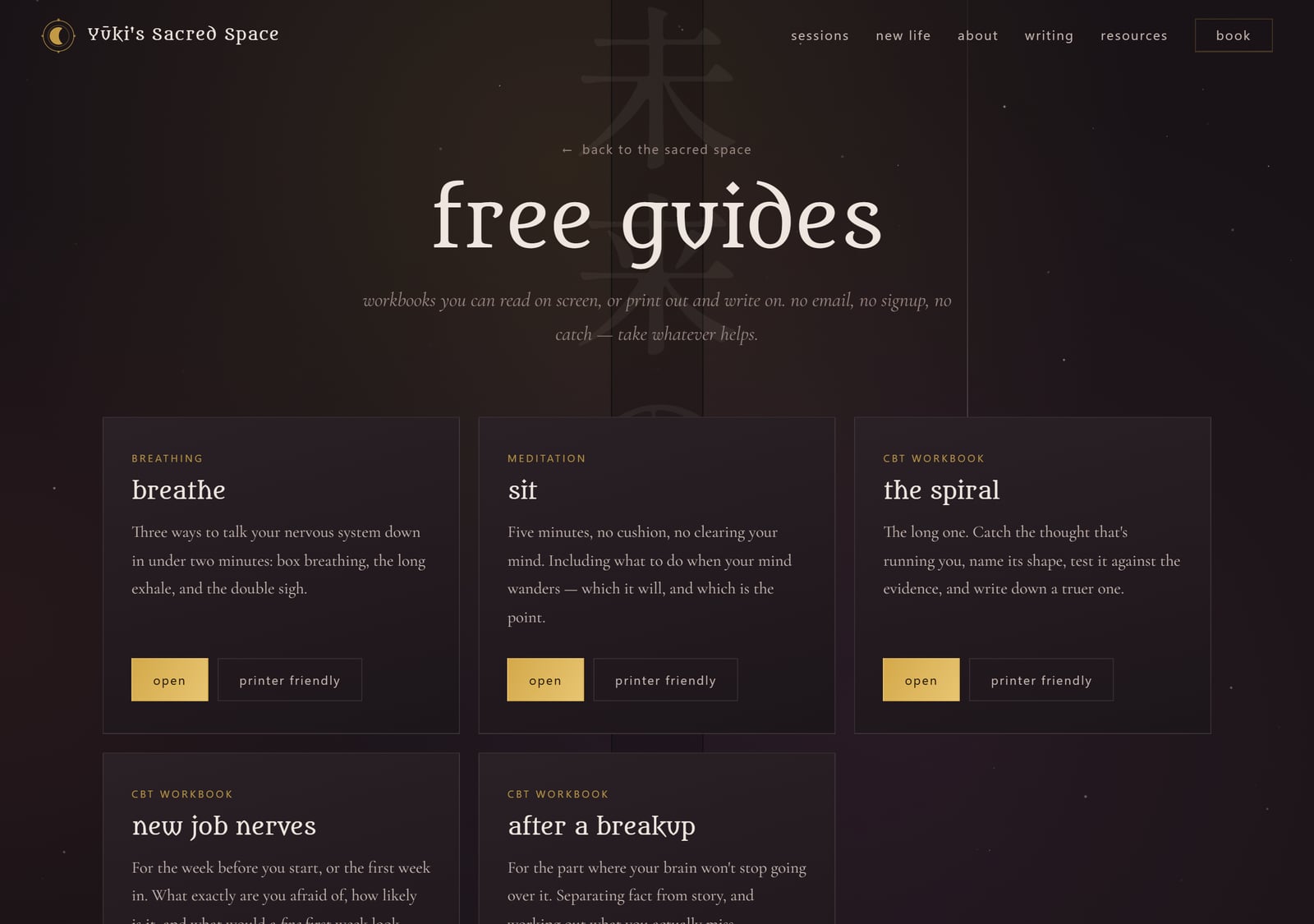
The best thing on the site is free.
The first real thing you hit on the site is five workbooks she gives away, before anything asks you for money or an email. Box breathing. A five-minute meditation. One for catching a thought spiral, one for the nerves before a new job, one for the grief after a breakup. They're built from plain CBT technique, the stuff a therapist would actually walk you through: catch the thought, name what your brain did with it, check it against what actually happened, write down a truer version. The prompts are short on purpose, like six to nine words each, because a worksheet with a paragraph-long question just doesn't get filled in.
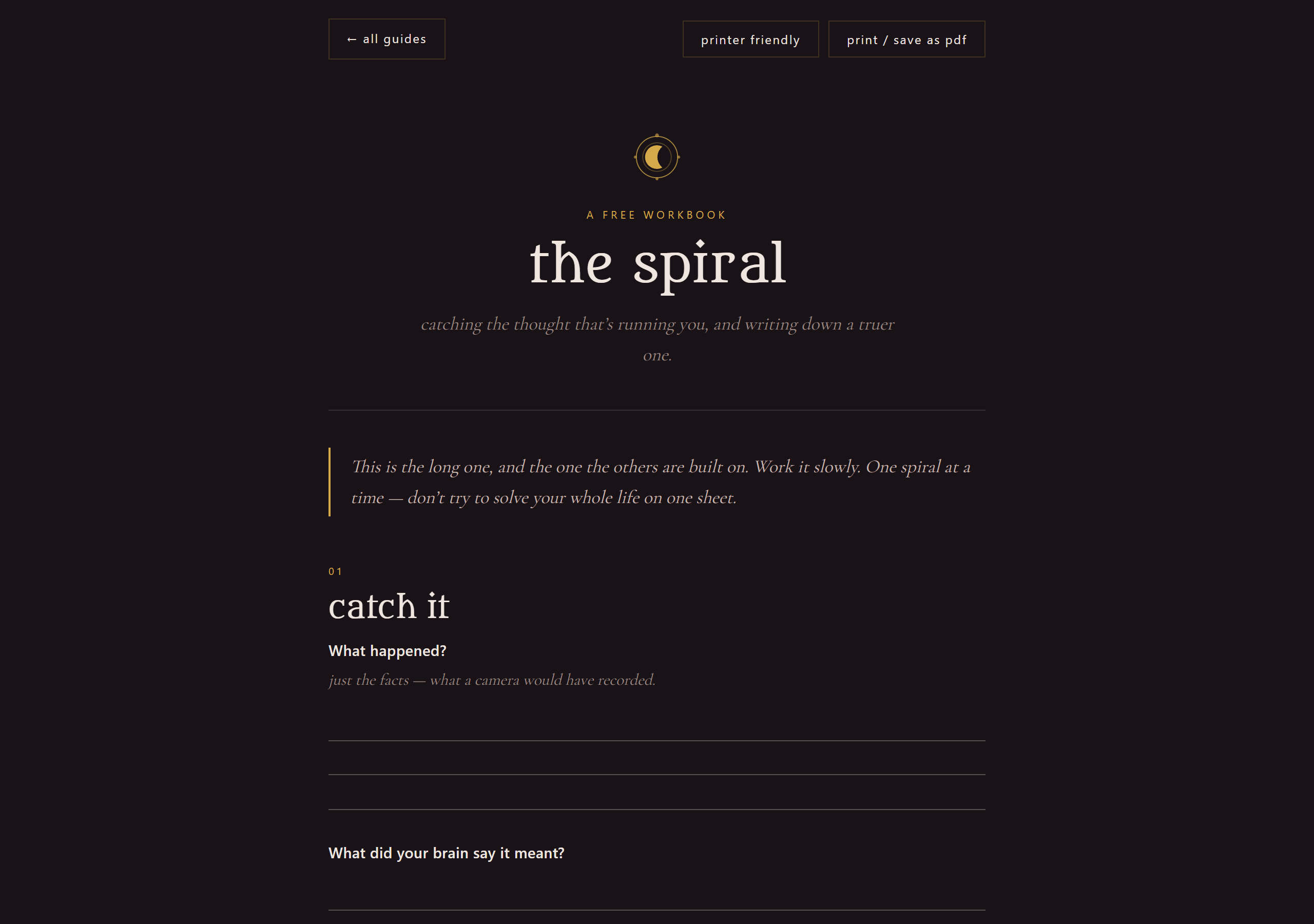
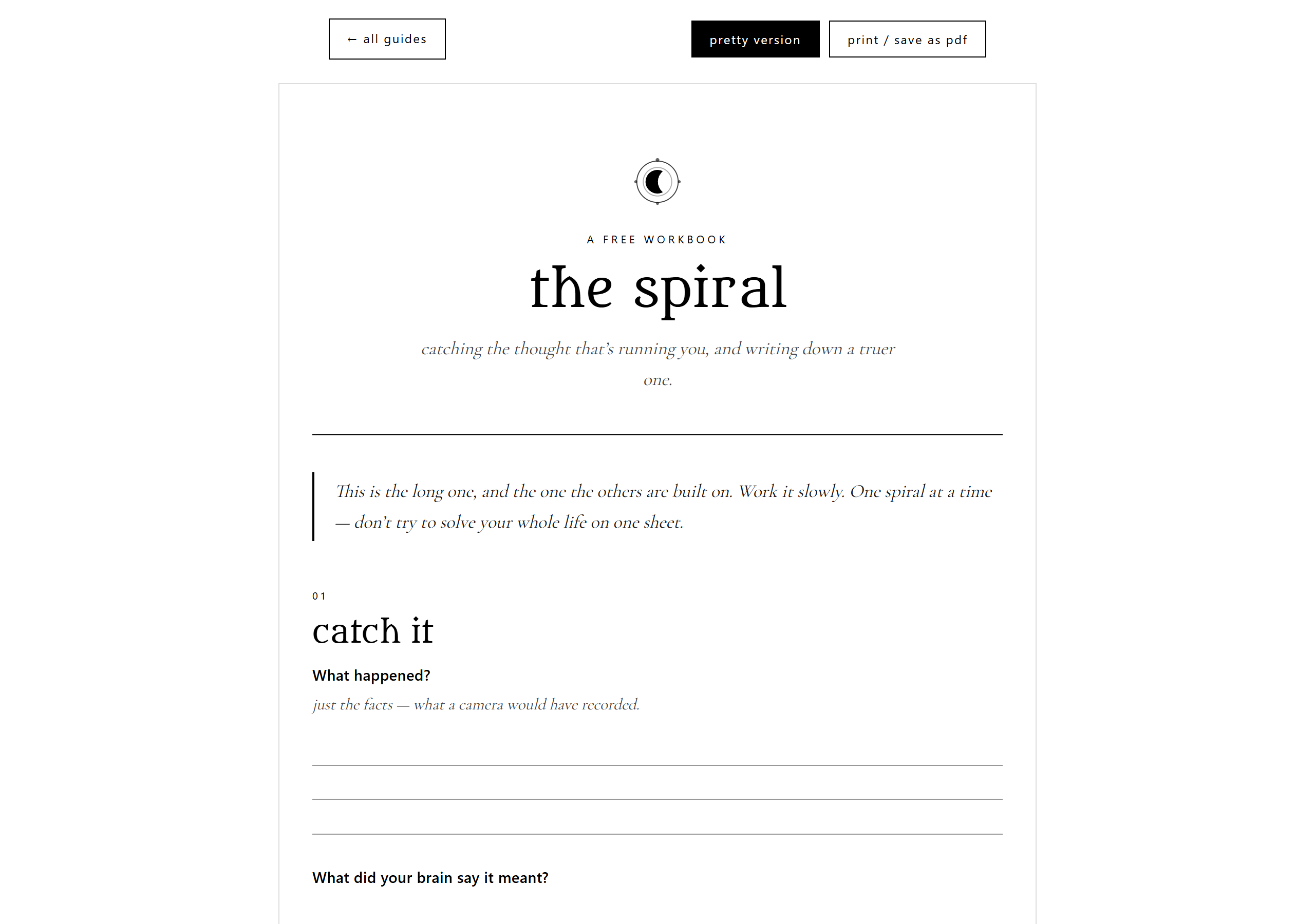
Every guide comes out of one file and renders two ways. On screen it's the dark branded version. Hit one button and it flips to clean black-and-white with real lines to write on, and printing always uses that one. It's the same file, so the pretty version and the print version can't drift out of sync. And because free mental-health material from someone who isn't a clinician has to be careful, every guide says plainly that it isn't therapy, and the three that get into real distress carry the 988 crisis line.
There's a real server under the reiki.
Most sites like this are a drag-and-drop template. This one runs the same stack I'd stand up for a software client: Node and Express, a MySQL database, real sessions, rate limiting, actual transactional email, database migrations, a newsletter, first-party analytics, and an admin panel she logs into. It lives on a Linux box behind nginx and PM2 with its own HTTPS.
Nobody reads any of that and thinks “ah, PM2.” They just land on something fast and stable that doesn't feel like a hobby, and that does most of the trust work before she's said a word. The boring invisible part is the part doing the heavy lifting.
I didn't touch her checkout.
She already had Square doing the actual work. The calendar, the payments, gift cards, the confirmation emails. All of that worked fine. Ripping it out to rebuild it myself would've put her income at risk to fix a problem she didn't have. So every “book” button just opens her Square page in a new tab and nothing about her setup changed. The new site is the front door Square was never going to give her.
The pricing is honest too. The three-month package is 24 sessions for $2,400, which comes out to $100 a session. At her normal $140 walk-up rate that same block of sessions would run $3,360, so it's a real discount for committing without quietly undercutting her single bookings. Grounding a mystical business partly just means being unmysterious about the money.
The spooky stuff is real code.
The witchy layer stayed. I just built it carefully enough that it reads as care instead of clutter. There are five fixed layers behind the page (an aura wash, a faint centering line, a column of vertical Japanese, a couple of slow spiders on threads, and a film grain), and every one of them sits under the content and ignores your mouse. The Japanese reads 未来の私のために, “for my future self,” and it's marked aria-hidden so a screen reader skips it instead of reading untranslated characters at a blind person. It scrolls exactly its own height, so the whole phrase reads through once by the time you hit the footer.
The spiders' speed is set in pixels per millisecond, because if you set a duration and also randomize how far they drop, the two cancel out and they always look the same speed no matter what you type (learned that one the annoying way). All of it shuts off if you have reduced-motion turned on. I checked it at 375 and 1310 pixels wide: nothing overflows, nothing clips at either end of the scroll, the body text sits at 5.4:1 contrast or better. Fussing over that is the actual grounding move. Careful reads as trustworthy.
Built for the skeptic.
There's a section on the site literally called for the skeptical & the curious, and the build backs that up. Semantic HTML, a skip link, focus rings you can actually see, screen-reader labels on every “book” button so they don't all just announce “book,” a print stylesheet, a sitemap, robots, a web manifest, a one-page brand sheet so her logo and colors stay consistent everywhere she shows up.
Her longer writing lives on Medium, and the site pulls it in as short teasers that link back out, so the two copies don't fight each other in search or split her readers. None of that is flashy. It all says the same quiet thing, which is that a real person runs this and they thought about you.
None of this is complicated. Most of it is just caring about the parts other people skip.
Yūki is good at her actual job. The site just needed to stop getting in the way of people finding that out. If you're good at your thing and your website is doing the opposite, that's the work I do.